Tuesday, March 30, 2010

Pritzker Winners- Kazuyo Sejima and Ryue Nishizawa of Sanaa

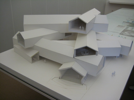
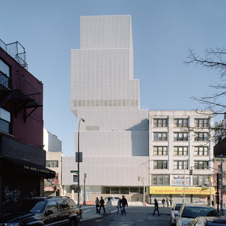
Awhile back I posted on the NYC museum designed by Kazuyo Sejima and Ryue Nishizawa of Sanaa Architecture because of its use of stacked structures. Well congratulations to the team, they won a most prized award in architecture, The Pritzker, today.  They are the first female/male duo to win the award.  Here's some of their work:
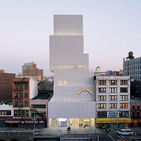
New Museum of Contemporary Art, NYC, 2007

Zollverein School of Management and Design, Essen, Germany, 2006

Drop Chair, 2005 

Christian Dior Building, Tokyo, Japan, 2003

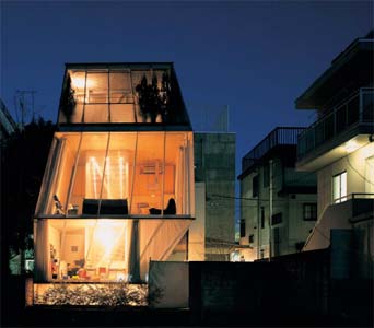
Small House, Tokyo, Japan, 2003 by Kazuyo Sejima

Monday, March 29, 2010

Tiny Bedrooms

i've been stalking craigslist for apartments in NYC for awhile now, but lately its a problem, I spend way to much time on that site.  After all my visits I've resigned to the fact that what I'm willing to pay for an apartment will not afford me the enjoyment of a huge bedroom.  Undoubtedly my bed is going to be the only focus of my room, as it will be the largest piece of furniture by far. I've gotten a little worried for fear that my room is going to appear juvenile with the bed taking up the most space, so I started googling images of interiors with a small layout.  Luckily I found that good design in a small space does exist.  

What I've found is that bedding is key, if it's going to be the focus of the room might as well splurge.  Awhile back I posted on quilts because I just wanted to cover up the old duvet cover I have now.  Now I realize how important by bedding will actually be and may be willing to spend a little more.

Also, apartmenttherapy.com just posted a sneak peek into the new book:  The Big Book of Small, Cool Spaces coming out May 11.  I'm sure this will be a source of inspiration for my first apartment in NYC.

Thursday, March 25, 2010

Ceilings- A surface too often forgotten

Outside the bedroom, ceilings are a surface too often neglected when it comes to interior design.  While they usually are not the visual focus when one steps into a room, they can provide function that normal walls cannot.  The ability to hang can create an uneven, dynamic surface as opposed to the  flat surface of a vertical wall.  Take for example this creative idea by Lorena and David of San Francisco (via inspiringmomma.blogspot.com).  They took simple embroidery hoops, stretched differently designd fabrics, and then hung them sporadically from the ceiling at different heights.  


I was at a Thai restaurant in Chicago recently and found similar inspiration in their tiny weighting area.  The restaurant hand hung Chinese umbrellas from the ceiling at varying heights.  The space was small, so the hangings did shorten the height of the room, but it had a cozy effect.  This photo was taken looking up, I'm getting an Iphone soon simply for better picture taking. 


This bedroom interior doesn't quite take advantage of the uneven surface idea, but it does do a good job of bringing the focal point of the room to the ceiling and aware from the walls.  

Monday, March 22, 2010

Norman Cherner Chairs

It's funny, I usually never look at one of my favorite blogs Unhappy Hipsters which features pictures from the design magazine Dwell for design ideas.  I'm always distracted by the witty and clever captions that follow.  Today however, I found something in this photo:


It was the chairs featured at the dining table.  At first I thought they were some sort of derivation of the Arne Jacobsen chairs I mentioned in this prior post, but they were actually designed by Norman Cherner in 1958 and are his mostly recognized design.  They are typical of mid-century modern design and are made of molded plywood.  I think it was the rounded arms that feature one piece of bentwood that caught my eye.

The Cherner Armchair via Design Within Reach, $1149


Thursday, March 11, 2010

CB2 Store Layouts- yowsa!

I've read about CB2's loud use of color on other design blogs- some love it, some hate it.  I guess this season its all about lobster and pea.  I was in one of the Chicago locations a few weekends ago looking for barstools for my sister's apartment and unfortunately was  a little overwhelmed by a few of their layouts.  There was saturation everywhere, the photos I took below don't do the lobster and pea justice.  


Their website is just as colorful.  Fortunately, I found some cowhide pillows I want:


I realize my in store pictures really suck...
It's interesting to see the overt use of color in the store and on the site, and yet catalog is more subdued.  The layouts in the catlog use plain accessories to frame one saturated piece.

Wednesday, March 10, 2010

Lose the Shade: bare bulbs

I really like the minimalism of a hanging bulb with no shade.   The design is modest and quickly presents the function of a light source.  In casual areas, there's no need for the formality of a shade, and they're practical in lighting small areas.  While the design seems rudimentary, the use of dropped lights consisting of a bare bulb and cord was an improvement in illuminating the small, dark work areas of tradesmen and thus increased their productivity.  Well I'm sold, utility and aesthetics all in one.  I think they would be great above an island in a kitchen of a loft space or clustered together above an eating area as seen below.   Some of the pictures below even use them more formally in a living area.  Instead of a traditional round light bulb, I think I would go for a vintage Edison style light bulb.  

(images from left to right via designsponge. com, apartmenttherapy.com, nibsblog.files.wordpress.com, and barnlightelectric.com)

I found a few online from left to right:
1) Barn Light Electric, $98.
2) Etsy seller, kamlampcompany, $75
3) Rejuvenation, $91.20


And some derivatives from left to right:
1) Vintage DIY Lindsey Adelman Chandelier via The Brick House
2) Etsy seller pgburrow, $499
3) Anthropologie, $148
4)Via unhappyhipsters.com

Wednesday, March 3, 2010

Stacked houses- Herzog & de Meuron VitraHaus

Swiss Architects Herzog de Mueron recently opened the VitraHaus on their Virtra "campus" in Germany which features designs by other architects included Tadao Ando, Zaha Haid, and Frank Gehry.  The building features a series of 12 houses stacked on one another with the structure ultimately reaching 5 stories high.   The interiors of houses are connected via winding staircases and some project outward from the whole structure at almost 16 feet, making for an intentionally anarchic display. The function of the house is in fact to display the designers Home Collections, a series of home furnishings in their "archetypal house."

 
(images via designboom.com)
Stacked houses or structures have been used in a number of other designs.  It just seems more structurally sound for each building of a building to line up and create a seamless profile.  However this traditionally makes for one homogeneous building.  In Herzog & de Meuron's design each interior is distinct to allow for the differences in the products each showcases.  In an apartment building, this makes sense too, each  owner can have their own distinct space within the context of a larger building.  Other designs that have incorporated the use of stacked structures include:

1) The Contemporary Art Museum in NYC by Kazuyo Sejima + Ryue Nishizawa/SANAA  (images via deankaufman.com) or 
2) Another proposed apartment building by Herzog & de Meuron at 56 Leonard St in NYC (image via manhattmuse.com) or
3) xsmall by Chaewon Kim + Beat Schenk of UNI Architects which takes the concept of stacked structures to complete one single home (image via designboom.com) and lastly
4) Habitat 67 in Quebec by architect Moshe Safdie.  Habitat 67 came out of Expo 67, where housing was a large focus.  The design aimed to incorporate the future of overcrowded cities. (image via expo67.ncf.ca)


Tuesday, March 2, 2010

Urban Outfitters Roundup 3.1.10

When I'm in need of inspiration, I check the Urban Outfitters site constantly to see when they add new furnishings to their apartment lineup.  They really cater to my needs and tastes- young, urban, and affordable.  Their aesthetic seems to be a little contemporary, a little lumberjack-rustic, a little urban, a little faux-vintage, a little mid-century modern (especially their furniture), mixed in with some really unorthodox finds. Fortuantely these styles are all to my liking. 

My only concern is that their quality may not be up to par.  Their furniture is quite expensive, and their reviews on products aren't always great.  Nonethless, their lineup offers great inspirations for apartment design ideas. 

Awhile back I was looking for a quilt, and I think I've found something perfect.

I also am really digging this Loop Chair.  I like the full circle the seat and back make together,  it kind of reminds of me of the classic Bertoia chair below.

Like I said, UO also offers some really unimaginable product designs like these ice cube trays shaped like AK-47 bullets.